
The People, Place and Space Newsletter #22
The People, Place and Space Newsletter #22
Avoiding white default, UX equity resources, and how Florence Nightingale changed the future of data visualisation

Hi folks, this month there were so many great articles it was hard to chose just a handful to include here. I hope you get as much enjoyment from them as I did ❤️
How Can Designers Build Interfaces That Avoid the “White Default?”
By Jacquelyn Ogorchukwu Iyamah

I’ve not heard this term before but it’s one all designers need to be aware of. This ranges from technology that doesn’t recognise non-anglo names to facial recognition that doesn’t recognise darker skin, and many other unwitting exclusionary design decisions we need to actively look for in our work. All of these are micro aggressions that build up over time for the person experiencing them until they are forced to “assimilate”.
People often view assimilation as something that is voluntary, but when digital products default whiteness, assimilation is always covertly or overtly forced.
A brilliant read, with a hat tip to Candi Williams for sharing 🙌
UX Equity Learning resources, for all
By Candi Williams
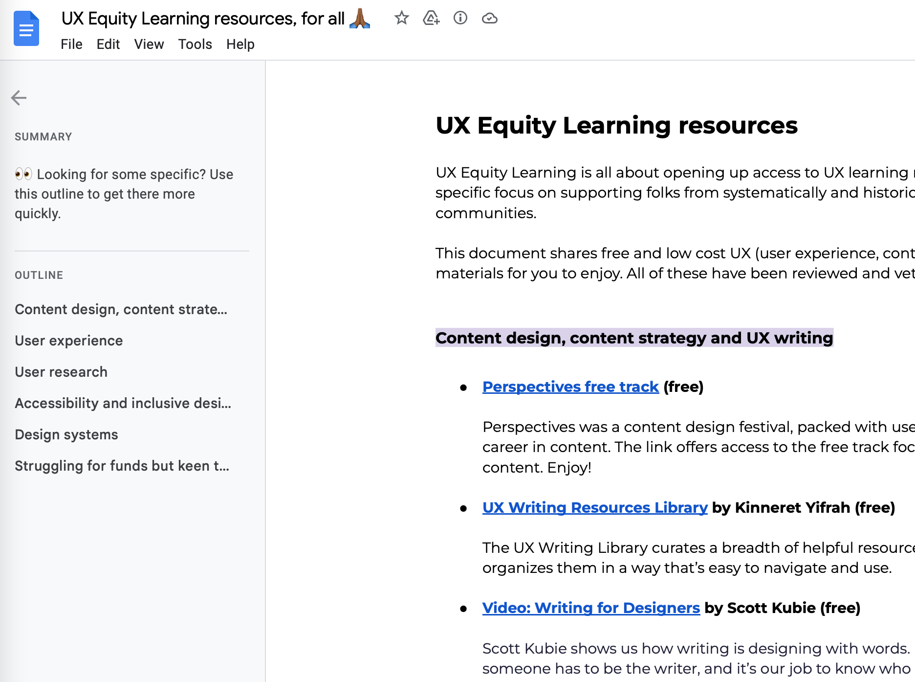
Picture: Screenshot of the contents of this amazing resource list
As a newcomer to UX and design it can be really confusing what courses and training you need to get started. On top of that, there is a vast amount of these available, and they really range in price. Candi has put together a great list of things that are either free or low cost to lower the barriers for entry into this exciting field.
How Florence Nightingale changed data visualisation forever
By RJ Andrews
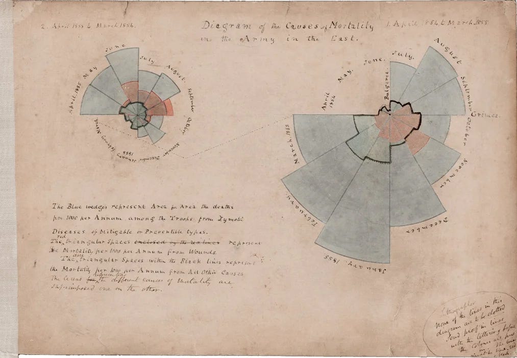
Picture credit: British Library Imaging Services
This article is a short introduction to a new book about “The lady with the lamp” and her visionary ways of communicating data visually about the deaths of soldiers during the the Crimean war. Ahead of her time, Florence used new techniques for surfacing key data points around why the unsanitary conditions of war were not only inefficient, but unjust and cruel to those suffering through them.
Recognizing that few people actually read statistical tables, Nightingale and her team designed graphics to attract attention and engage readers in ways that other media could not. Their diagram designs evolved over two batches of publications, giving them opportunities to react to the efforts of other parties also jockeying for influence. These competitors buried stuffy graphic analysis inside thick books. In contrast, Nightingale packaged her charts in attractive slim folios, integrating diagrams with witty prose. Her charts were accessible and punchy. Instead of building complex arguments that required heavy work from the audience, she focused her narrative lens on specific claims. It was more than data visualization—it was data storytelling.
The book has been published alongside some others focussed on graphic communications.
Also worth your time
After re-visiting several studio Ghibli movies lately, I found The importance of design in Studio Ghibli Filmography to be a great read
A lovely piece on how to research new components and design patterns from Amy Hupe
Truthish by Ethan Marcotte is a great quick read and provocation on what we mean by “one source of truth” when we talk about design systems
I love a good book list, and this one really delivers if you want to be more human centred in your work
If you’re interested in Information Architecture and design history, this little article about how filing cabinets shaped the Information Age is a must read
A long read on designing for societies most vulnerable people, and how doing so benefits us all. There is a linked article to a more in depth report here.
Three simple rules for collaboration between design and development - short and impactful principles from Tim
What I’ve been up to
This month I have been forced to go slower - not only is it the summer holidays in the UK, when may people are away and work naturally slows down - but the rising temperatures in the UK provided a natural restriction in the number of things you can (comfortably) do. I’ve mostly been hiding in the shade and keeping cool!
The most energetic thing I did was write a new article about managing your time, and some of the unconventional (and subversive!) ways you can preserve that time. Of course I had to shoe horn in some references to Seinfeld…
That’s all for this month, take care folks and see you next month!
Laura