
The people, place and space newsletter #13
The people, place and space newsletter #13
Design strategy, cognitive flexibility and stunning visually accessible furniture

Hi folks! Welcome to the people place and space newsletter, a monthly look at the best human centred design articles and news, tailored for people that love designing for people.
Laura
Fear and loathing in design strategy
By Modernist Studio

Image credit: Modernist studio
We all know that involving clients and stakeholders in design work can sometimes be a fraught affair. This article talks about how a lot of the issues that occur from doing so stems from fear, and more importantly - how to alleviate those fears.
IQ Tests can’t measure it, but ‘cognitive flexibility’ is the key to learning and creativity
By Barbara Jacquelyn Sahakian, Christelle Langley and Victoria Leong

Image credit: Robert and Talbot Trudeau/Flickr
This is a fascinating look at the roots of creativity and innovation - for something so intangible there’s a lot of tangible, scientific evidence for how to “train” yourself to be more creative.
IQ is often hailed as a crucial driver of success, particularly in fields such as science, innovation and technology. In fact, many people have an endless fascination with the IQ scores of famous people. But the truth is that some of the greatest achievements by our species have primarily relied on qualities such as creativity, imagination, curiosity and empathy.
Creative thinking is so much more than being “arty” - it’s an exceptionally valuable skill that is foundational for any discipline. It’s one of the number one traits I look out for as a hiring manager during recruitment - not just design “creativity”, but creativity of thought, approach and perception.
Designing furniture with a 7:1 colour contrast ratio makes a huge difference for the visually impaired
By Rain Noe
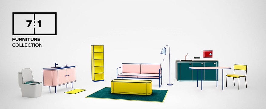
Image credit: HomePro
"When developing furniture for people with vision impairment, we discovered that 90% of all the furniture in the world uses similar color shades in their components, resulting in very low color contrast in each piece," - HomePro
It’s amazing what you take for granted. Most furniture is designed to be low contrast, blending into the background and causing innumerable problems for those with sight impairments. The team at HomePro took this on as a design challenge and have come up with this highly effective collection of high contrast furniture.
Other things I’ve been reading
Academic articles every designer should read - an excellent list I’m slowly working my way through
The Ministry of Justice digital team has released their service design playbook - containing a wealth of information for anyone designing public services. You can view the playbook as a Miro board here
A timely and interesting piece about football fan behaviour - Why do hardcore football fans behave like rutting stags?
The hilarious sequel to Antoine’s previous article, Nine new nasty UX truths (potentially NSFW). I didn’t agree with all of it, but there are some on point observations in there.
The rise of blandscaping, and why not all greenspace is created equally - An interesting analysis on the concept of “copy and paste” landscaping, a term that effectively describes so many of our green spaces
Power of maps and maps of power - a look at the power dynamics of maps, with a great resource list
What I’ve been up to
This month we put up six - yes six! - bookshelves in our living room to accommodate our growing library. It’s been fun looking back though old books I’ve read and rediscovering the notes and bent page corners in some of them. I’m tempted to start offering library cards to people who visit… 📚
…Saying that, I do have a small amount of space on those shelves, so i’m open to your recommendations for what I can add to my library 😃
Thanks for reading, more next month 🙌